Kris Kandel
photograper
I just spent a LOT of time fixing one page on my website: the contact me page. I had this really cool idea of a photo of me with falling envelopes (you know, “contact me”).
Easy right?
Well … NO.
DO you know how HARD it is to coordinate falling envelopes? They are worse than babies and dogs combined. Very fickle indeed.
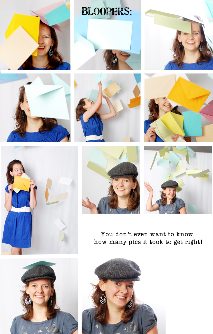
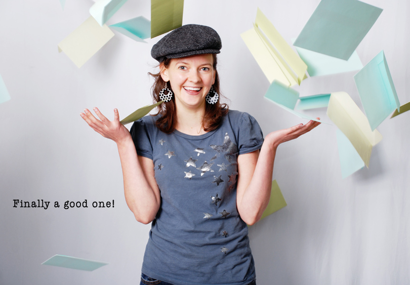
After a long shoot (and three paper-cuts later) I finally had a photo I liked, until I put it on my website. I realized that the colors of the envelopes clashed with the mood of my site… Orange and Yellow don’t do great with Gray/Green peaceful tones. Soooo back to the backdrop in another outfit, with only green and blue envelopes. Success!!
Below are some of the outtakes and rejects. Enjoy!

And the photo I chose… drum roll…

Tada! Go check it out on the contact me page of my website: Here
CUTEST IDEA EVER! Absolutely love it! I also REALLY like the pic of you on the left… where you can see your whole blue dress (ADORABLE outfit) and you have the cutest expression!
Awww thanks! It’s so fun to get a comment on my blog again! The picture on the left in the blue dress was the first choice that clashed with color/tone. I still like that photo, but the other one just works better in the design. 🙂 Ooof, it sure took a long time to do such a ‘simple’ change!
Oh man, I can imagine!!! But you’re right, the colors in the last pic go along with your web design beautifully! It just makes your contact page come alive!!! 😀
I was going to say, I LOVED the blue dress one when I was scrolling down through! But I think the other meshes better with your colors/theme! Are these an example of self-timer at work? If so—I’m even MORE so impressed!
Thanks!! Actually I rounded up my family to help snap the shots and throw the envelopes. Much easier than trying to do it all myself. 🙂